To access the customizer, from your dashboard navigate to Appearance > Customize where the settings are organized into logical tabbed sections. These are the global options for your website. If you want to set specific options for a specific page, post, or portfolio, set them in Metabox settings which will override the general setting. You can locate the metabox in every page/post/portfolio.

General Section
You can set general options for your site in this section: Global (ex: Lazy Load, Sticky Sidebar, Google Analytic), Share Button, 404 Page, Layout, Breadcrumbs, Transition, Newsletter, Merge Script, and Custom Code.
Social Account Section
Show list of social icons which style is set on social icon section in header settings. To set up your social account go to Appearance > Customize > Social Account.
Header Section
There are many possibilities in creating your header. You can easily use the drag and drop builder in Baklon to create your website header. To begin modifying, navigate to Appearance > Customize > Header on your admin panel. There you can set up all elements in the header with the live preview on the right side. You can also set these header elements for your site in this section: Logo & Site Identity, Header Before & After, Header Section 1, Header Section 2, Header Section 3, Sticky Header, Navigation, Dropdown, Header Transparent, Off Canvas, Social Icon, Search, Mobile Element, Contact, Newsletter, and Button Header.
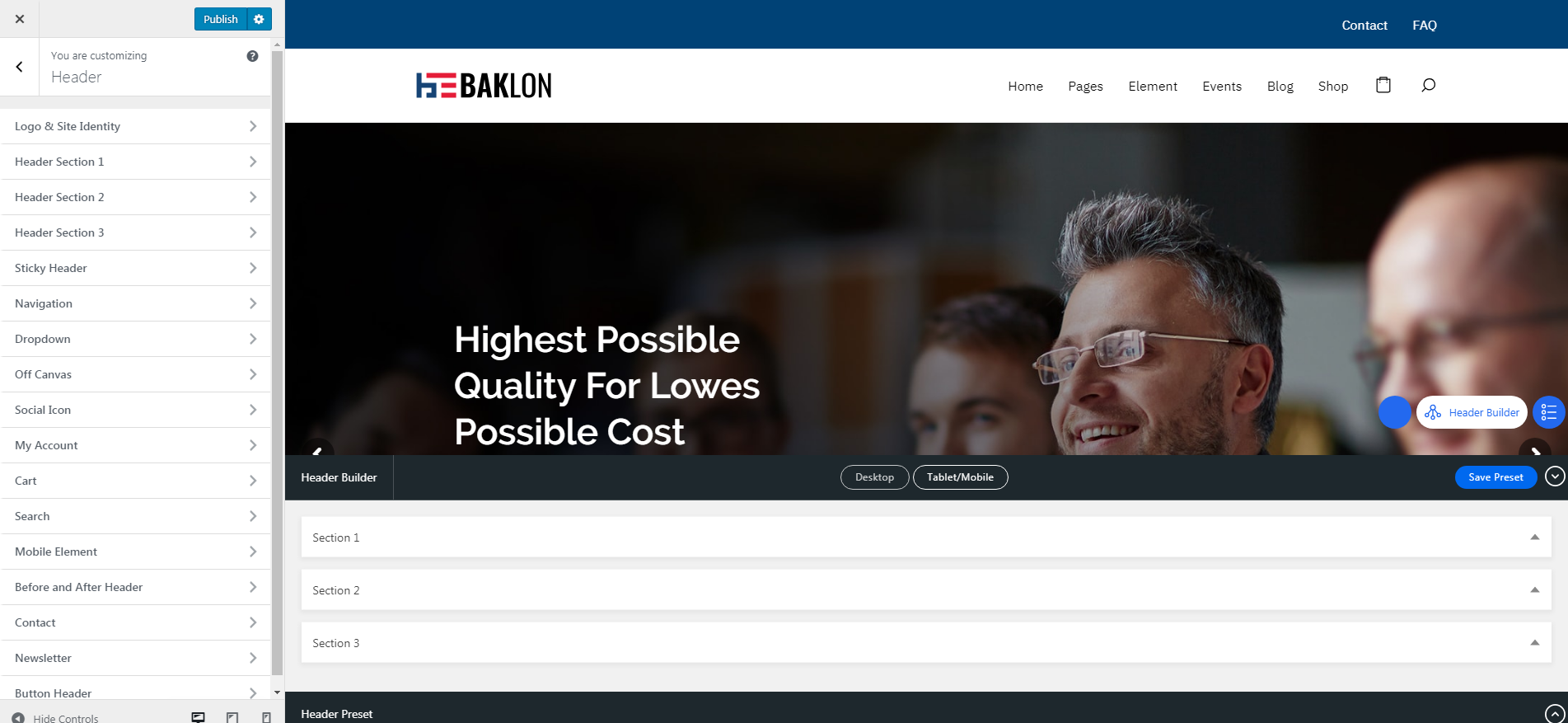
When you go to the header settings, the drag and drop builder will appear on the bottom of the live preview. It allows you to drag and drop elements into header areas, which is divided into three section. Sections in the builder represent each area in the header while the columns represent the position, depends on the layout you choose (e.g. in general, if you drop an element at the right side of the first section, the element will be displayed at the right side of your top bar).
The placement order in a section also represents the position (stack) of elements.
- Section 1 – First row: to drag and drop elements for the top bar.
- Section 2 – Second row: to drag and drop elements for the main header area.
- Section 3 – Third row: to drag and drop elements for the bottom of the header
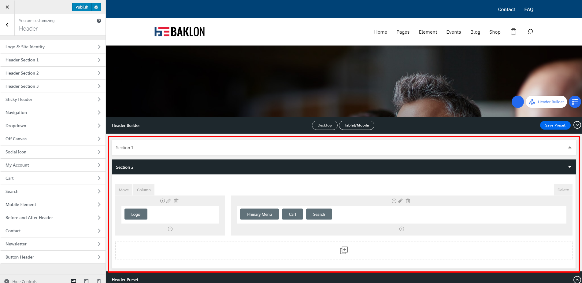
NOTE: Clicking the blue gear symbol in each tab section or element will take you directly to the page settings of the selected section/element. You can modify the selected section or element quickly without having to go to its section in header settings manually.

Footer Section
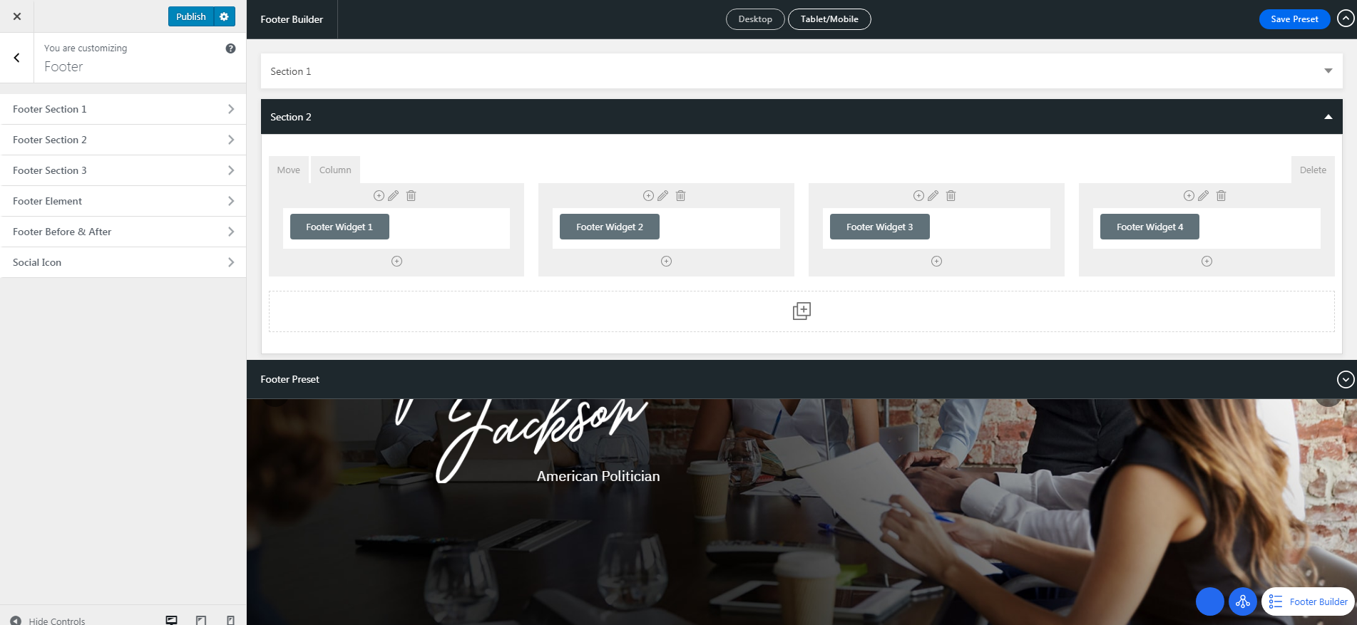
The same as building your header, you can easily use the drag and drop builder to create the website footer. Navigate to Appearance > Customize > Footer on your admin panel to set up your footer. You can set these footer elements for your site in this section: Footer Element, Footer Before & After, Footer Section 1, Footer Section 2, Footer Section 3, and Social Icon.
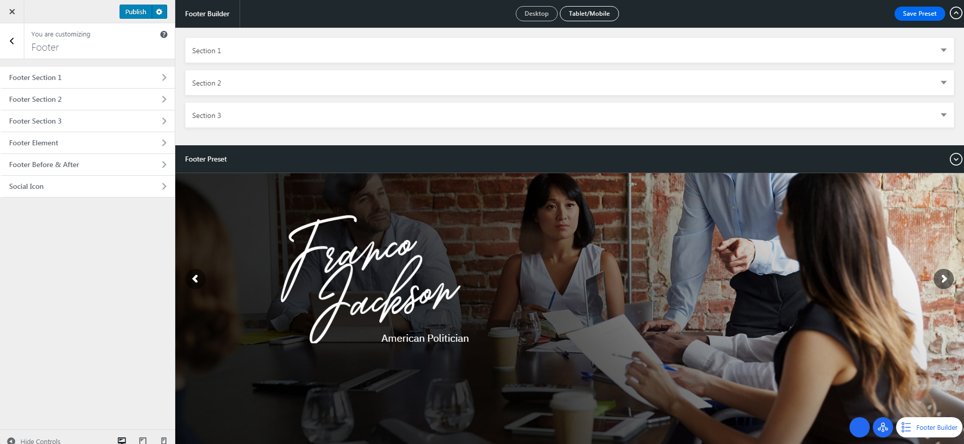
When you go to the footer settings, the drag and drop builder will appear on the top of the live preview. It allows you to drag and drop elements into footer areas, which is divided into three section. The Sections in the builder represent each area in the footer while the columns represent the position, depends on the layout you choose.
The placement order in a section also represents the position (stack) of elements.
- Section 1: to drag and drop elements on the top of footer area, may consist of every footer element.
- Section 2: to drag and drop elements on the bottom of footer area
- Section 3: additional row showing the pre-built elements that are not in use. You can drop elements you do not want to use here or drag elements to place it in the footer.
NOTE: The number of columns depends on the chosen footer layout. Every time you change the footer layout, you need to re-assign the elements into the builder.
The builder provides the shortcut to modify each element using Edit button for each element. The button will take you directly to the page settings of the element without having to go to its section in footer or widget settings manually.
Color Section
These options allow you to set custom colors for these elements in your site: General Color, Button Color, and Transparent Element Color.
Blog Section
You can set up these options in this section – Archive Layout, Blog Template, Single Post Layout, and Featured Area.
Portfolio Section
You can set up these options in this section – Portfolio Archive & Portfolio Single.
WooCommerce Section
This section will appear if you install WooCommerce plugin. You can find the e-commerce settings of our theme such as Product Catalog, Shop, and Single Product settings.
Page Section
You can set up page layout globally in this section.
Typography Section
Fonts in Baklon are customizable. Everything you need to adjust your website fonts can be found in Appearance > Customize > Typography. Select the source of the font you use, either Google Font or Adobe Typekit.
- Main Font: applied to heading, widget title, and share text.
- Secondary Font: applied to body elements, such as body text and post meta.
- Variant: font weight.
- Subset: alphabet type.
For main navigation, header menu, drop-down menu, and button, you can choose which font to use between Main Font & Secondary Font.
Backup Section
This section enables you to backup your setting from Header, Footer, and Customizer Settings.